It's been fascinating to see how artists have responded to the Bridgette Mayer Gallery's redesigned space since its official reopening in November 2011 - in particular, the ways in which the gallery's "old guard" have rethought their former quarters when having their first solo shows in the "new" space.
It's the same historic building, of course, but it now has one very long wall running along a somewhat narrow hallway, and one huge, spectacular one in the back that literally draws gallery visitors like a giant magnet. The new iteration is also as polished and professional as it used to be cozy and relaxed.
Surprisingly, though, considering they might have been intimidated by their new digs, all of the longstanding gallery artists who've had one-person shows at Mayer since 2011 have risen to the challenge, none more so than Tim McFarlane. In his first solo show in the new space, he has managed what many artists before him have not been able to do - find the right balance and scale of works for the hallway and then make the most of that huge back wall.
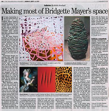
With "Presence," McFarlane has also created one of his most cohesive bodies of work to date; the small paintings displayed in the front room and along the hallway announce that right away. In each, energetically painted gestural lines form netlike compositions that coalesce with varying background colors, conjuring different places and experiences, musical rhythms, and McFarlane's own riff on the physical act of painting.
So many paintings of the same size need not have been hung so close together - a strategy that's been employed in other shows here to take advantage of the long wall but that tends to undermine the individuality of works - but the paintings across from them are varied in scale and color and more anomalous in this show, such as his bucolic, lovely Vortex, which combines a gestural composition with an inner open space that looks like a clearing in a forest.
McFarlane's enormous site-specific painting, We Dance to Pray, on the back wall is the most exciting, visceral use of this wall to date, allowing viewers the sensation of walking into the painting. At the same time, it is a logical progression in his show (as was Eileen Neff's photographic work on this wall in her show at this time last year), not straining to be a separate "project."
In the gallery's Vault Room, Stuart Netsky is making his first solo appearance at Mayer, with a small but pithy exhibition of digitally printed rubber floor mats and mixed-media sculptures that muse on the life and character of Marie Antoinette, in particular her superficiality, extravagance, and hypocrisy. This is a historical period tailor-made for Netsky's wit and fluency with materials.
Two of his rubber mats, Kings, combining images of Yul Brynner, Michael Jackson, the Cowardly Lion, Henry VIII, the Disney version of The Lion King, and others, and Queens, with a similar diversity of female rulers, hanging downstairs, should not be missed.
Bridgette Mayer Gallery, 709 Walnut St., 10 a.m. to 6 p.m. Tuesdays through Saturday. 215-413-8893 or www.bridgettemayergallery.com. Through Oct. 5.
